نكست أمستردام
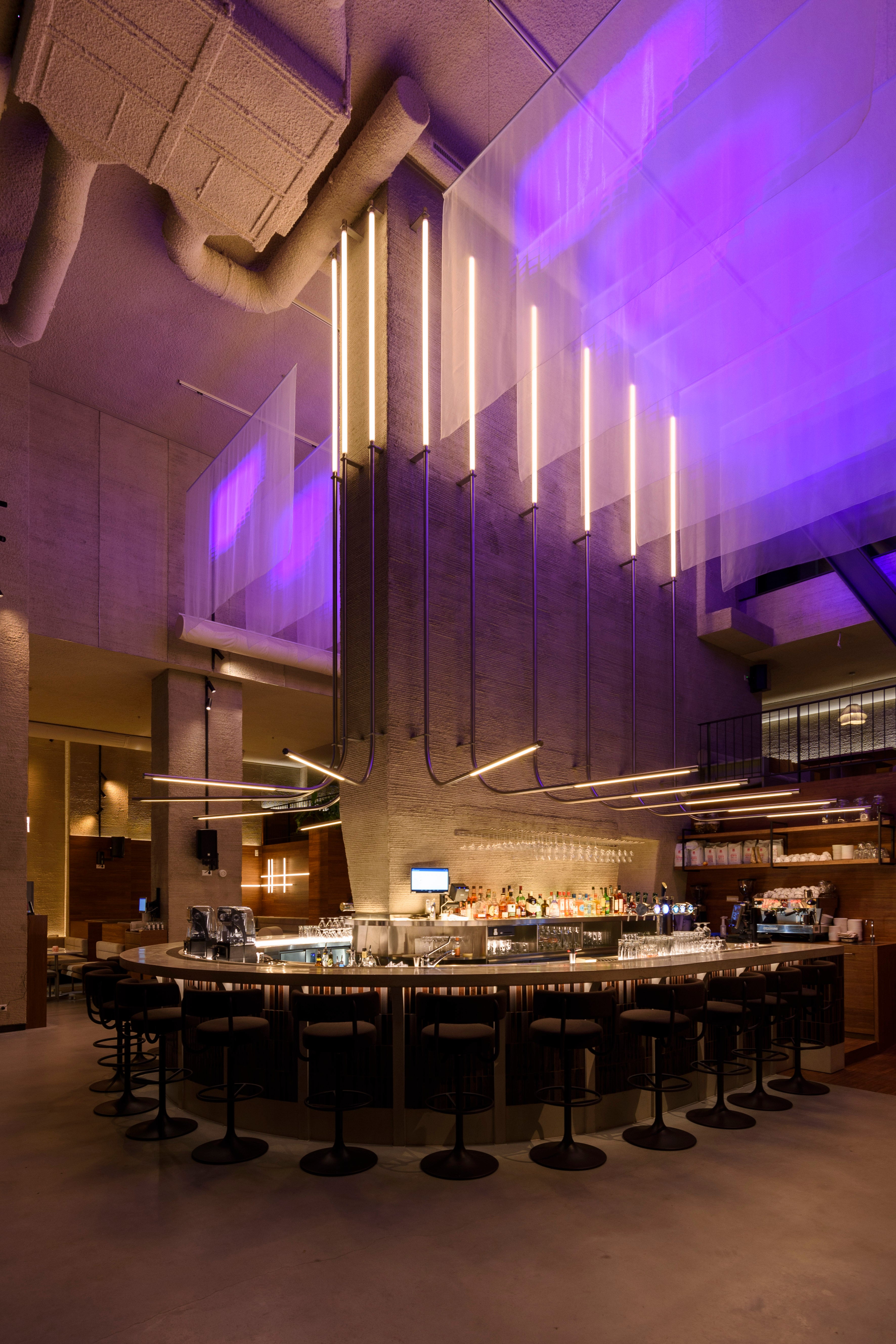
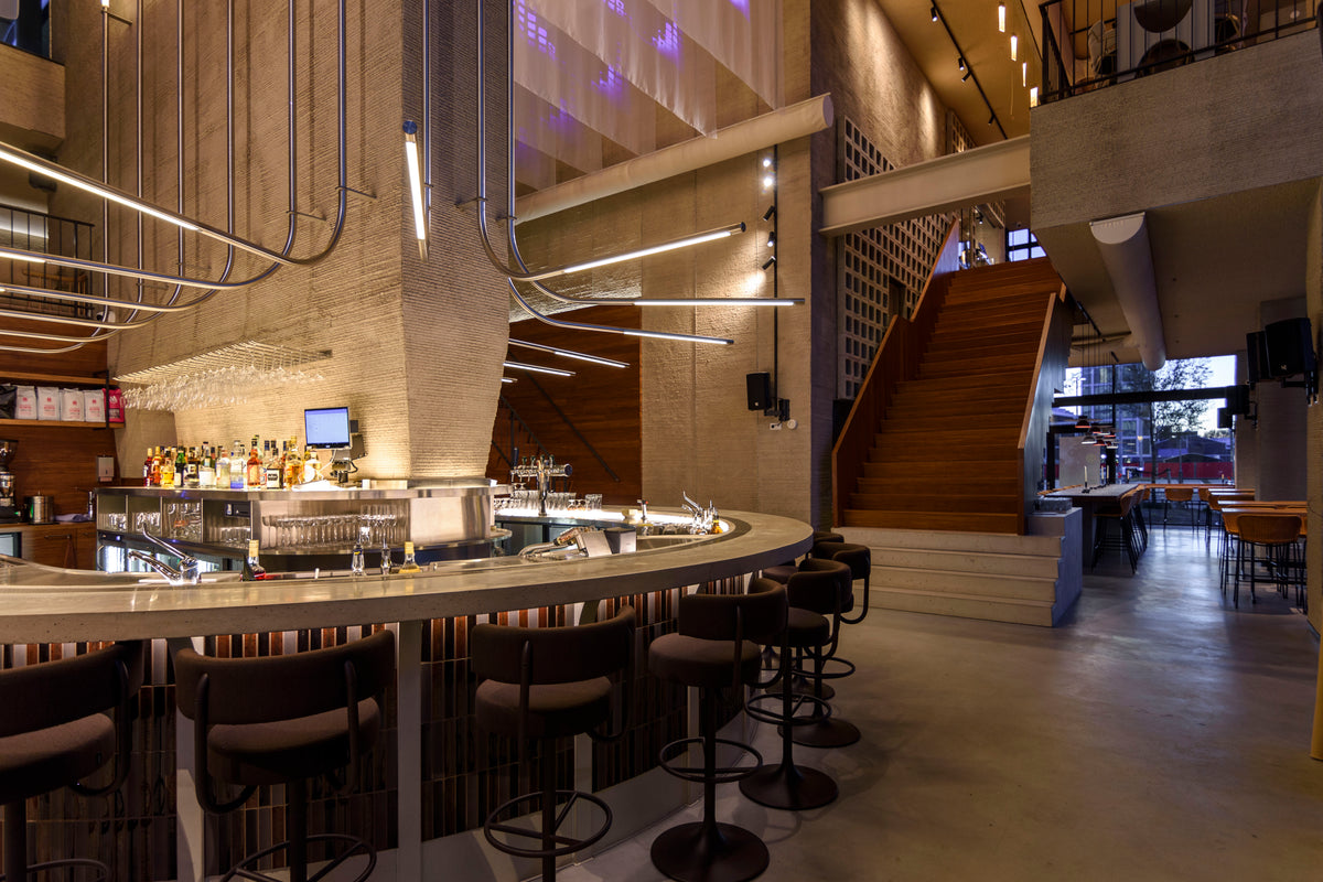
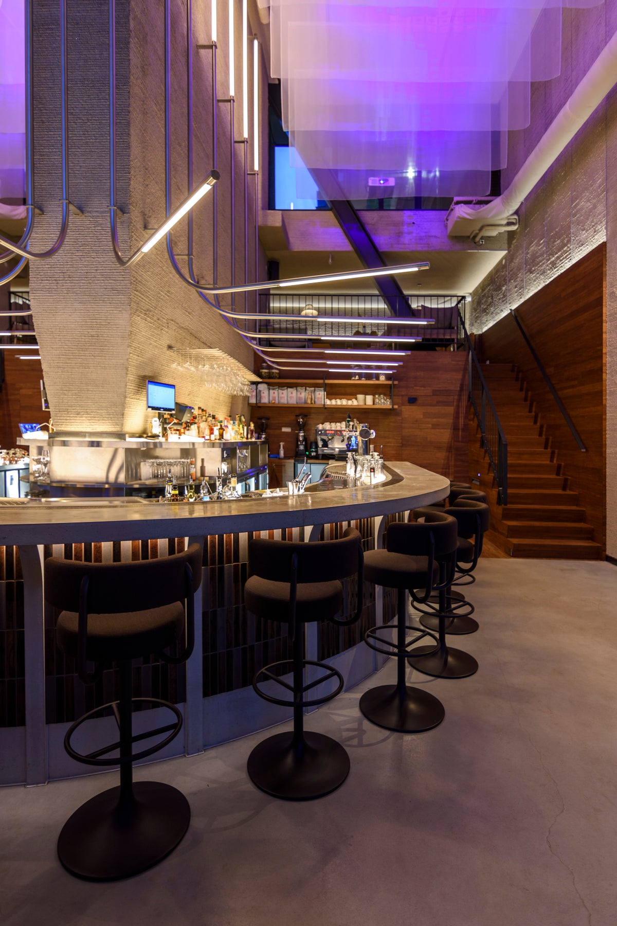
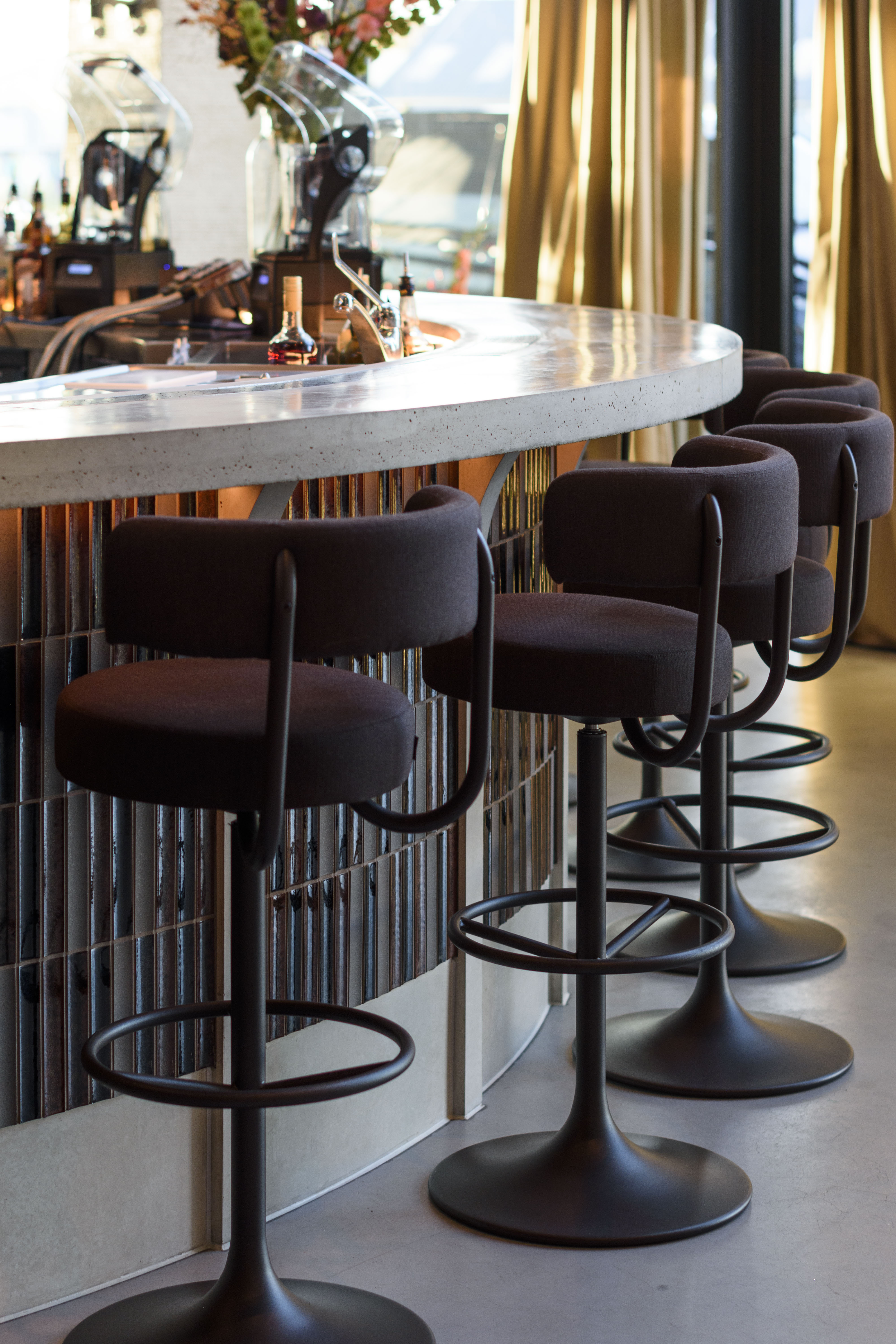
في NEXT أمستردام، تم استخدام أربع مجموعات بلاط يابانية بمقاييس مختلفة - من البار المركزي وجدران غرفة الطعام الطويلة إلى لوحة مميزة مؤطرة وأسطح الطاولات المشتركة. معًا، تضفي هذه المجموعات ملمسًا وإيقاعًا وتنوعًا ماديًا على التصميم الداخلي المتقن للضيافة في TANK.
معلومات المشروع
المشروع: NEXT أمستردام
الموقع: رصيف NDSM، أمستردام نورد، هولندا
السنة: 2023
التصميم الداخلي: TANK
العميل: NEXT
إدارة المشروع: PRJCT WRKS / غييس يانسن
المنفذ الداخلي: Fiction Factory
المورد: Mittsu Japanese Tiles
التطبيق: تصميم داخلي للضيافة
مجموعات وألوان البلاط:
سايرين — مزيج بني
يوهين — مزيج بني
حدود بيوساي — أبيض
حدود كويوهين — رمادي حمامي
مجلد صور المشروع: NEXT أمستردام
أربعة أسطح، أربعة أدوار معمارية
بدلاً من تكرار تشطيب واحد في جميع أنحاء المشروع، يخصص المشروع لكل بلاطة دورًا مميزًا. ترتبط المجموعات بنسبها الضيقة وأسطحها المصقولة، لكنها تختلف في المقياس والنقش واللون واستجابتها للضوء.
يسمح هذا للعمل الخزفي بدعم تسلسل هرمي للمساحة الداخلية: حيث يظهر البار كمركز ثقله، ويمنح جدار غرفة الطعام عمقًا للمحيط، وتكافئ العناصر المبلطة الأصغر الانتباه الدقيق.
سايرين في البار المركزي
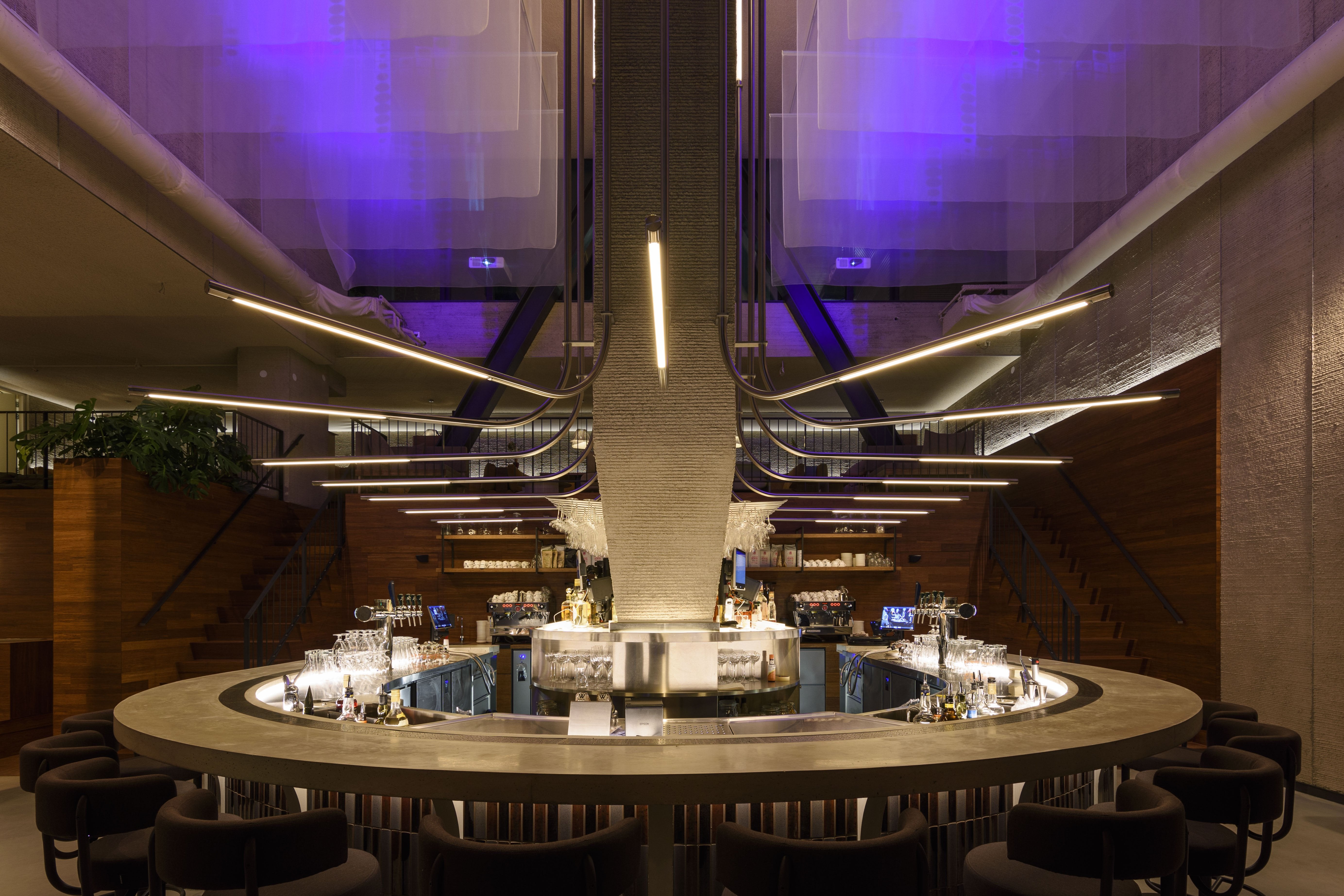
يغلف بلاط سايرين (Sairin) ذو المزيج البني حجم البار المركزي الكبير. تتبع قطعه العمودية الرفيعة منحنى واجهة البار، بينما يضفي مزيج الزجاج البني حركة عبر سطح يمكن رؤيته من كل جانب.
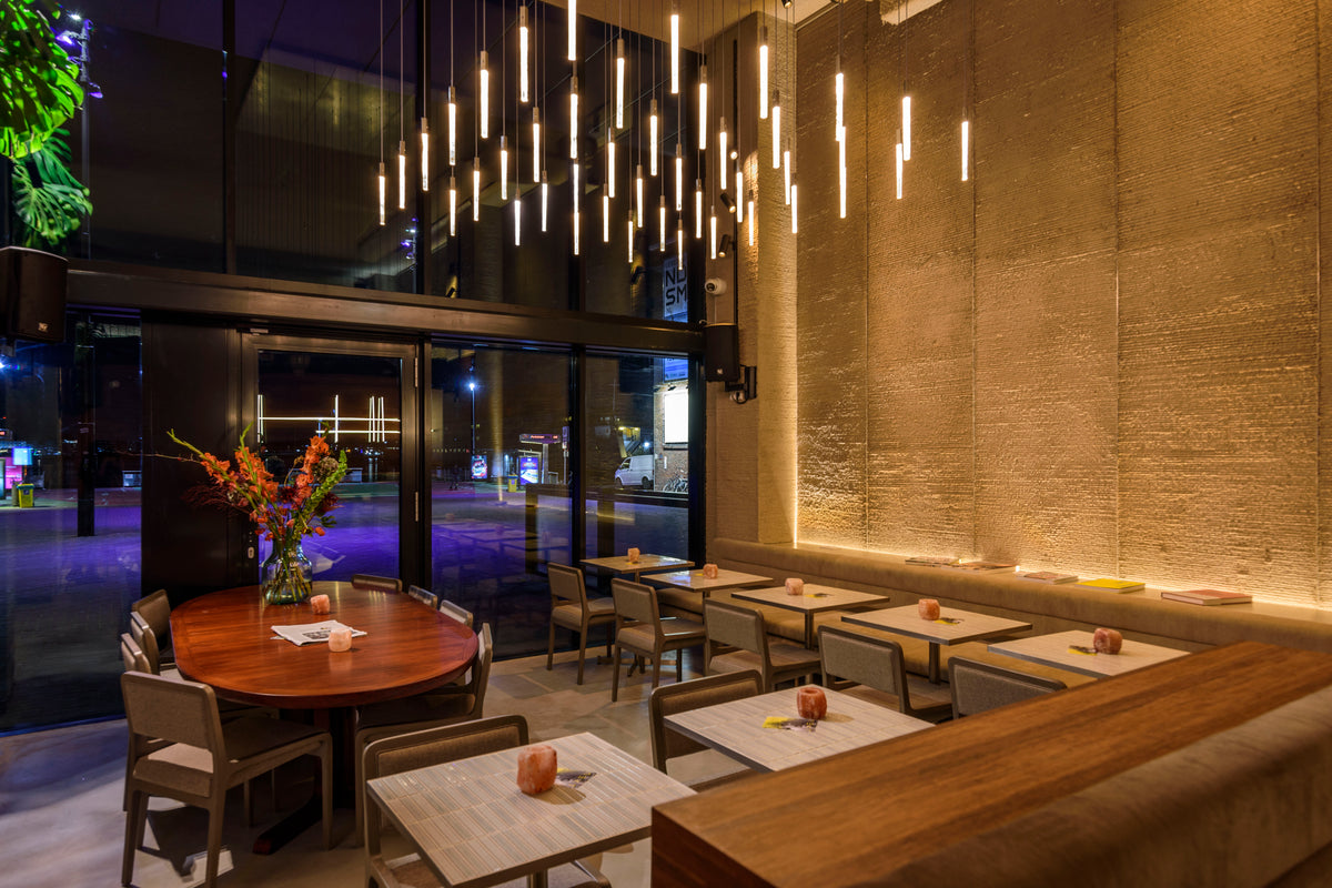
في المستوى العلوي، ترتفع نفس المادة عبر الفضاء ذي الارتفاع المزدوج. يربط الخط العمودي المتكرر للبلاط البار بالإضاءة المعلقة والإطار المعماري الأكبر دون تسطيح السطح إلى حقل موحد.
حدود بيوساي وجدار غرفة الطعام
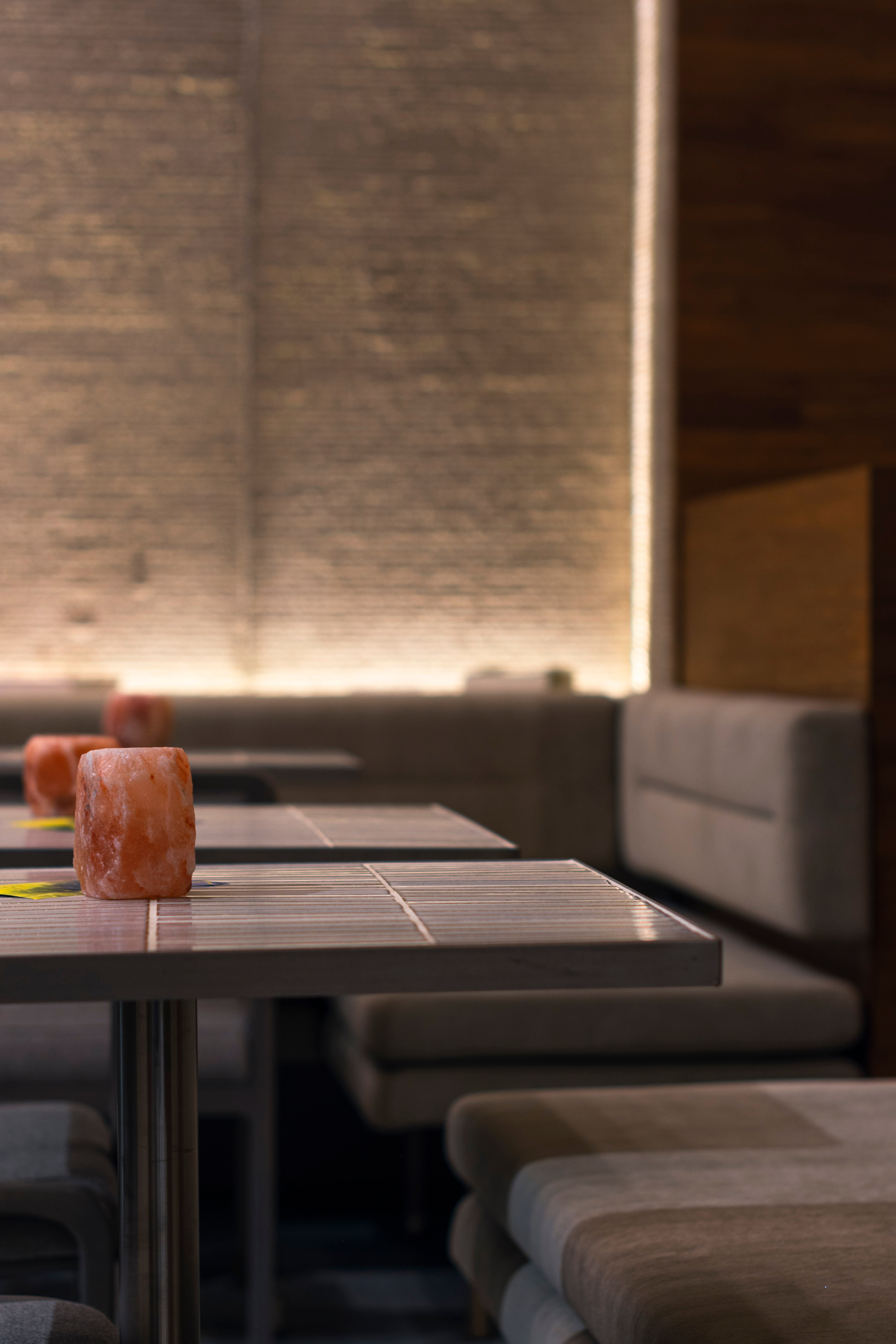
يُستخدم بلاط حدود بيوساي (Biyusai Border) باللون الأبيض عبر جدار غرفة طعام مرتفع. يلتقط الضوء المنحدر النقوش الدقيقة، مما يجعل الجدار يظهر بشكل مختلف من الداخل الأكثر إشراقًا في النهار إلى الأجواء الدافئة في المساء.
لا تزيل الطبقة الرقيقة اللون الأبيض الملمس. بدلاً من ذلك، تجعل التغييرات في الظل والإضاءة أكثر وضوحًا عبر ارتفاع الغرفة.
يوهين عبر الطاولات المشتركة
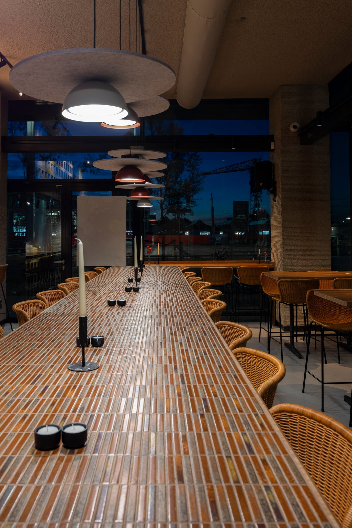
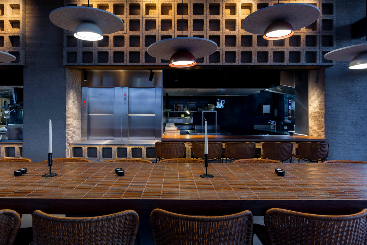
يوهين بالمزيج البني يُستخدم على مستوى اليد عبر الطاولات المشتركة الطويلة. يصبح تباين الزجاج تجربة فورية ومن مسافة قريبة، يتماشى مع الحواف الخشبية والمقاعد المنسوجة والمطبخ المفتوح الداكن.
عند استخدامه أفقيًا، يؤسس البلاط الضيق سطحًا اتجاهيًا يعزز طول الطاولة مع الحفاظ على دليل القطع الفردية المصقولة.
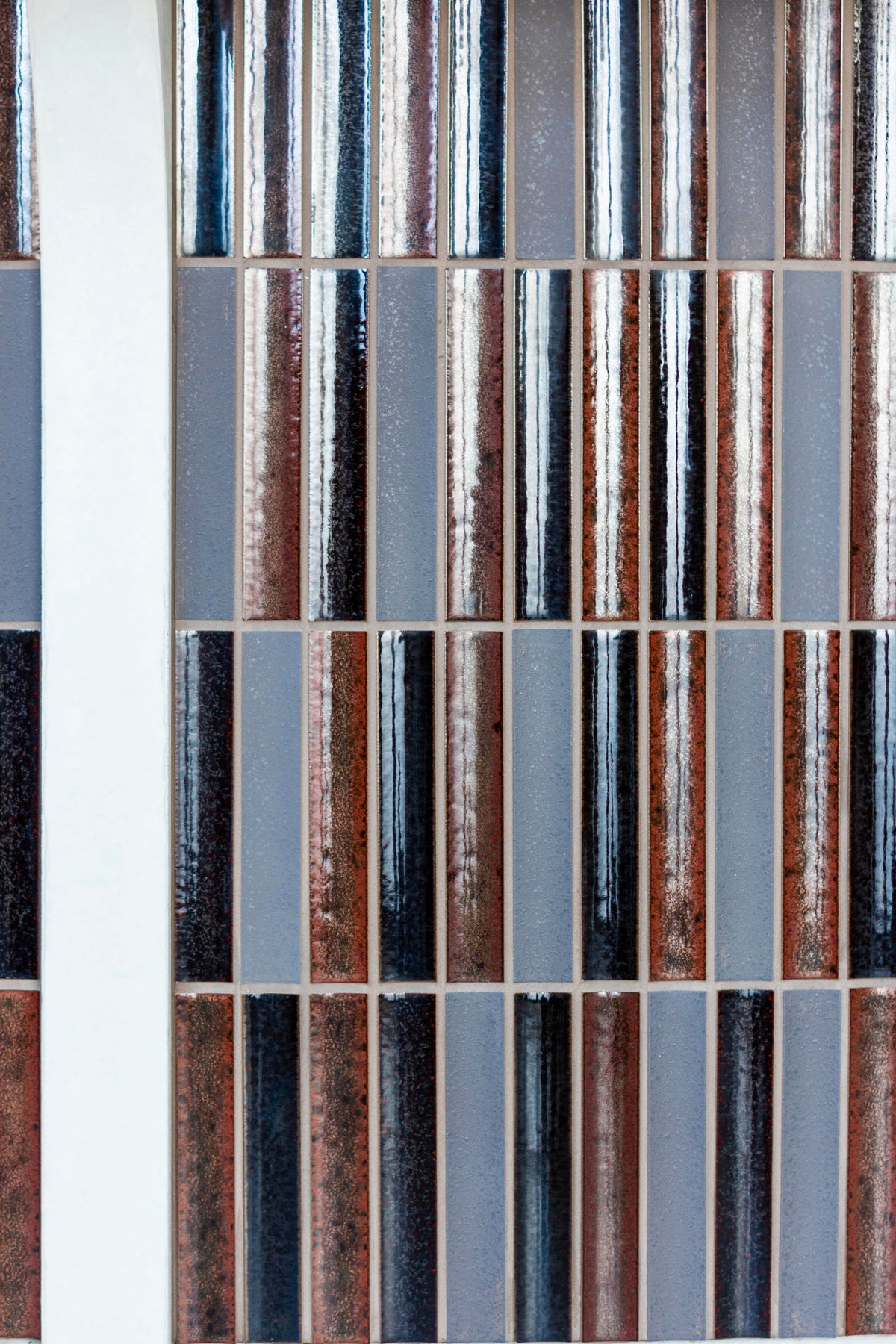
تفصيل مؤطر بلون رمادي حمامي
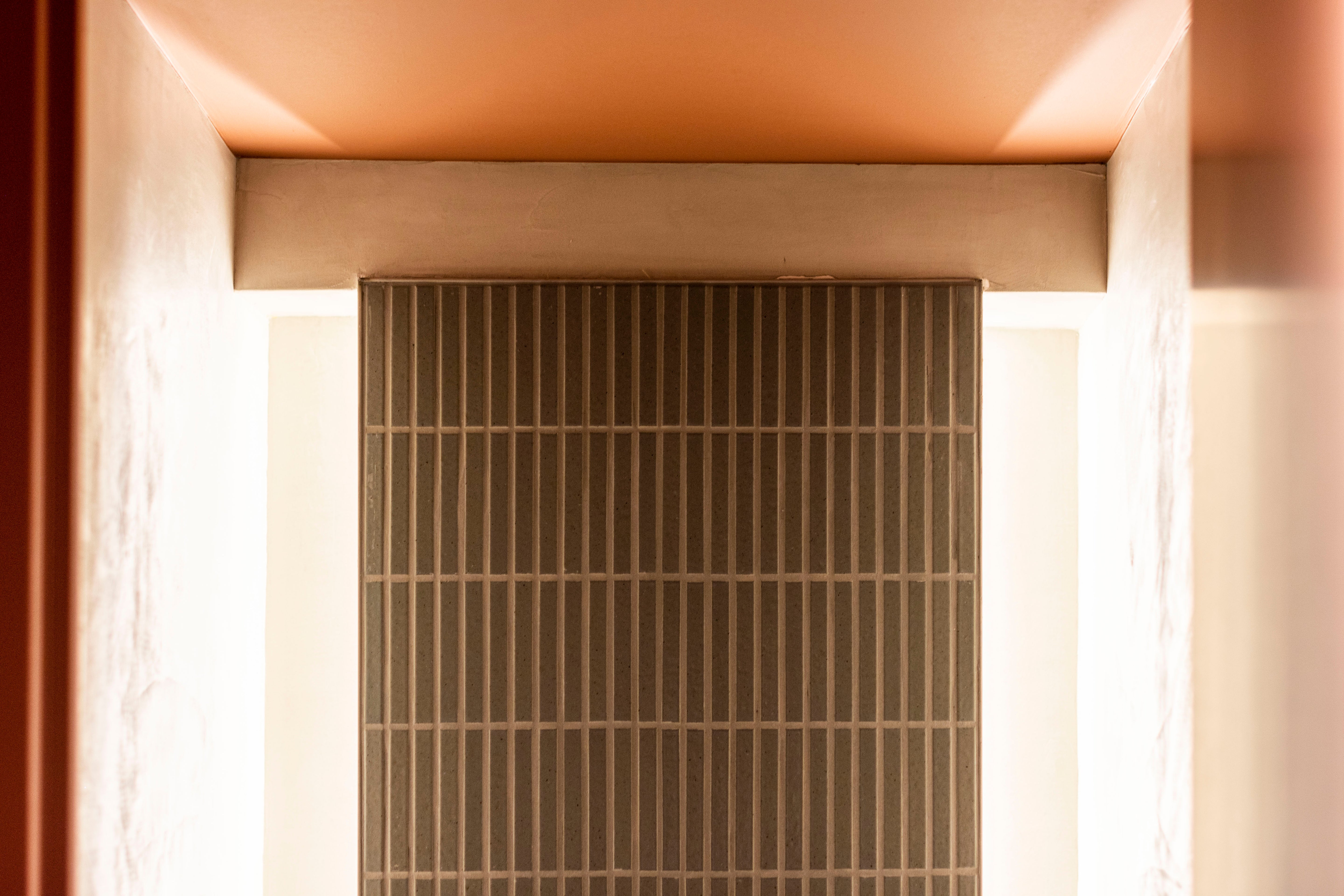
يشكل بلاط كويوهين بوردير (Koyohen Border) بلون الرمادي الحمامي لوحة مميزة مؤطرة أصغر. يوفر ترتيبه الرأسي الدقيق تباينًا أكثر هدوءًا للتطبيقات الأكثر اتساعًا في أماكن أخرى من المطعم.
شخصية المادة
عبر التطبيقات الأربعة، تستجيب الأسطح الزجاجية للتغيرات في الضوء، مسافة الرؤية والاتجاه. لا يُضاف الاختلاف اللوني كتأثير مطبوع؛ بل يظهر من خلال المواد وعمليات الحرق التي تشكل كل قطعة.
تُظهر NEXT أمستردام كيف يمكن للبلاط الياباني أن يتجاوز مجرد جدار مميز واحد. هنا، يصبح السيراميك جزءًا من تنظيم المساحة الداخلية - تحديد العناصر المركزية، المحيطية والمشتركة من خلال السطح، المقياس والتكرار.
استكشف مجموعة يوهين واطلب عينات من مجموعة يوهين. استخدم قائمة البلاط لاستكشاف المجموعات الأخرى المستخدمة في هذا المشروع.
تعرف على البلاط الياباني
تعرف على اختلاف الزجاج الياباني
الأسئلة الشائعة
من قام بتصميم NEXT أمستردام؟
تم تصميم الديكور الداخلي من قبل استوديو TANK ومقره أمستردام.
أين يقع NEXT؟
كان المطعم يقع في رصيف NDSM في أمستردام نورد.
ما هو البلاط الياباني الذي تم استخدامه؟
سايرين مزيج بني، يوهين مزيج بني، حدود بيوساي أبيض، وحدود كويوهين رمادي حمامي.
كيف تم استخدام البلاط؟
تم وضعها على البار المركزي، وجدار غرفة الطعام، وأسطح الطاولات المشتركة، ولوحة مميزة مؤطرة.
مقال بواسطة Mittsu Japanese Tiles
بإشراف إيان رينولدز