Grout Colour
How Grout Colour Transforms the Look of Japanese Tiles
When designing with Japanese tiles, grout colour plays a crucial role in the final appearance of your installation. The same tile can take on vastly different aesthetics depending on the colour of the grout used. Whether you want to highlight individual tiles, create a seamless flow, or enhance depth, grout selection can make all the difference.
Below, we explore how different grout colours impact the look of a beautiful green Japanese tile, using the provided images as examples.
1. White Grout: A Clean and Classic Look
Image 1 White grout creates a crisp and fresh appearance, making the tiles stand out. It emphasises the natural variation in glaze and enhances brightness. This is ideal for modern, minimalistic designs where clarity and light reflection are essential.

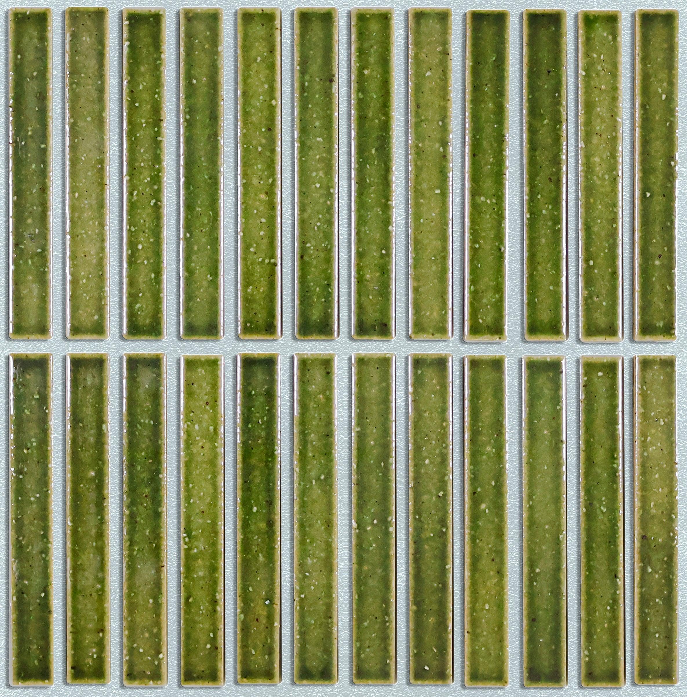
2. Dark Grout: A Bold and Defined Aesthetic
Image 2 Using dark grout results in a dramatic contrast, outlining each tile and enhancing its structure. This choice is excellent for contemporary or industrial-style interiors where strong visual definition is preferred. It also helps conceal dirt, making it a practical option for high-traffic areas.

3. Light Grey Grout: A Soft and Harmonious Blend
Image 3 Light grey grout creates a balanced, subtle transition between tiles. It maintains the beauty of individual tiles while allowing them to blend cohesively. This versatile option works well in both modern and traditional settings, offering a timeless aesthetic.

Choosing the Right Grout for Your Design
-
For a bold, eye-catching look: Use a contrasting grout colour to emphasise individual tiles.
-
For a seamless, subtle effect: Opt for a grout shade that closely matches the tile colour.
-
For a balanced appearance: Select a neutral grey grout to create harmony without overpowering the design.
Grout is more than just a filler—it’s a design tool that can elevate the look and feel of your Japanese tiles. When selecting grout, consider the mood you want to create and how the interplay of colours will impact your space.
Here are some links for designers we work with
https://susanvenn.com/
https://www.stephanie-thatenhorst.com/
https://www.studiotashima.com/
https://realm.ie/
https://www.barde-vanvoltt.com/
https://www.inax.com/
https://www.rokarestaurant.com/
https://tatjanavonstein.com/
https://blacksheep.uk.com/
https://qualitycaviar.se/\
https://www.luxresorts.com/en/mauritius/hotel/luxgrandbaie
http://trilbeygordoninteriors.com/
https://aojnd.com/
https://bergmandesignhouse.com/
https://www.basha-franklin.com/
https://www.davidcollins.studio/
https://smlightarchitecture.com/
https://www.kellyhoppeninteriors.com/
https://framework.eu/
https://martinkempdesign.com/
http://www.talafustok.studio/
https://bone.studio/